Facebook unveils new design for its Messenger app
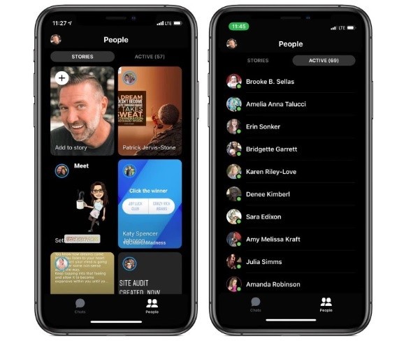
The changes are part of a larger Messenger redesign that reorients the People tab around Stories as Facebook continues to try to dominate the ephemeral social media format it copied from Snapchat. The People tab now defaults to a full-screen sub-tab of friends’ Stories, and requires a tap over to the Active sub tab to see which friends are online now.
The change will apparently push users towards more time spent speaking with friends and viewing content, rather than speaking with chat bots, business and playing games. The Discover tab looks to be out, meaning the only tabs you’ll see will be Chat and People. People will have two sub-tabs, one for Stories and one for Active.